I thought I would finish my writing on the Jerwood Drawing Prize by taking a closer look at three works in the exhibition and offer a couple of short reflections. With over seventy artists in the exhibition there were obvious difficulties in trying to sum up such a diverse range of positions and approaches. As I noted last week, drawing is a slippery term, and I think that definitions are probably best left to lexicographers. I’ll be back next week exploring Jerwood Encounters: Family Politics.
The Jerwood Drawing Prize will be travelling to the Hatton Gallery, Newcastle, Plymouth College of Art, and Sidney Cooper Gallery, Canterbury, so there are plenty of more opportunities to see the work for yourself over the next 6 months.

“Ever Tried. Ever Failed. No Matter. Try Again. Fail Again. Fail Better.”
Samuel Beckett
The only thing harder than starting is finishing. So lets start again. Lets never finish. What does it feel like to go into the studio again and again, day after day? An old tutor once told me that his work would often start on the desk, then move to the floor and finally end up in the bin. If it was rescued from the floor, and moved back onto the desk, it was a ‘goer’. Maybe every artist should have a version of Scott Robertson’s Chin Up, 2013, in their studio. Right next to Fischli and Weiss’s ten point manifesto, How To Work Better.
Of course, what comes first, the crumpled paper, or the phrase ‘chin up’? How much of this despondency is choreographed? Aren’t great artists meant to make it look easy? It seems flippant – taped to the wall, cocky perhaps. The neat line graphic line works in contrast to the crumpled paper. Chin Up seems to be about trying too much and not enough. Was it Bill Hicks who famously said comedians are the most serious people you will ever meet?

“Drawing makes you see clearer…clear enough until your eyes ache.”
David Hockney
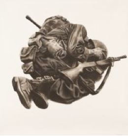
If Scott Robertson is perhaps claiming John Cage’s credo that he has ‘nothing to say and he is saying it’, then Misdemeanor’s work is an art of social issues. What does drawing bring to our understanding of a photograph? Is it a documentary image or something imagined – fact of fiction? The soldier has been removed from any contextual or historical narrative. Details date the soldier; certainly 20th century, perhaps 2nd World War, maybe Vietnam. The work is large and unframed, and nailed to the wall – it feels like like the figure is being crucified.
The image is antithetical to a Don McCullin type heroism. If at first the drawing seems to bulldoze any subtly, further complications are suggested. We’re being asked to identify and empathize with the soldier, yet any narrative resolution is resisted, his face remains hidden. The image is an archetype, offering the broad brush strokes of a dream rather than the detail of a memory. David Hockney once said that drawing something was a way of rescuing it, and this notion of paternalistic care seems significant. Perhaps, through drawing this soldier Misdemeanor’s work offers a similar attempt at remembrance. This lack of identification recalls the war memorials that scatter towns across the country – a monument to the idea of war. The lack of identification enables the soldier to become a cypher for ‘every man’. Although figurative, parallels can be made to Minimalism (which became the default aesthetic of memorials). Both ask us to project our own subjectivities onto them, they absorb multiple historical and ideological positions.

“I’m at a place called vertigo (where is it?), it’s everything I wish I didn’t know, except you give me something I can feel..”
U2
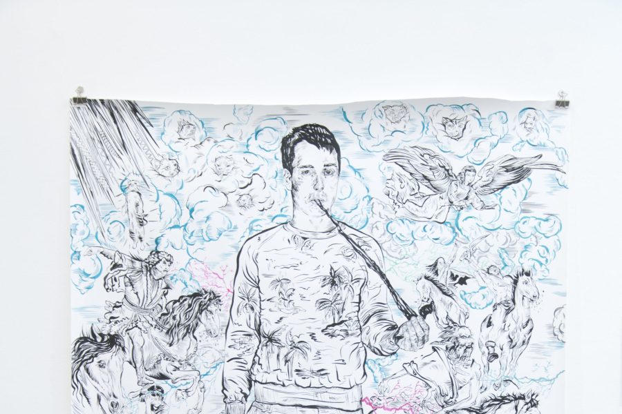
What does it mean to give time to something? To really invest. Gary Lawrence often works on his drawings over a year, their surfaces are so marked by the process, they look like leather – full of small tears, and creases from the heavily worked surface. It is interesting to note that the artist always uses biros and has made a series of works on the back of old posters salvaged from Woolworths. He takes the materials of recession and bureaucracy and fashions something altogether more otherworldly. This excessive labour seems important. As everything becomes increasing liquid (economy, technology, and socially) we seek responsive strategies of resistance. Societies tend to build monuments and museums at moments of transition and growth. China is currently building over a 100 museums a year.
Perhaps we can see Lawrence’s Saint Stansted as a similar quest for monumentality? The current interest in materialist archeologies most notably expressed during last year’s Documenta further articulates this shift. We could look towards the Polish sociologist Zygmunt Bauman formulation of a move towards a ‘light’ and ‘liquid’ state (service economies) from a ‘solid’ and ‘heavy’ type of modernity (industrialism) . The heaviness in Lawrence’s work seems to counteract the vertigo induced by the liquidity articulated by Bauman. It is a material and spiritual heaviness that, I think, can be paralleled by the Chinese buzz for museum building, or the quest for material genealogies. Lawrence’s work is about rooting, and anchoring – simultaneously creating other worlds while attempting to make sense of this one.
……………………………………………………………………………………


