1)
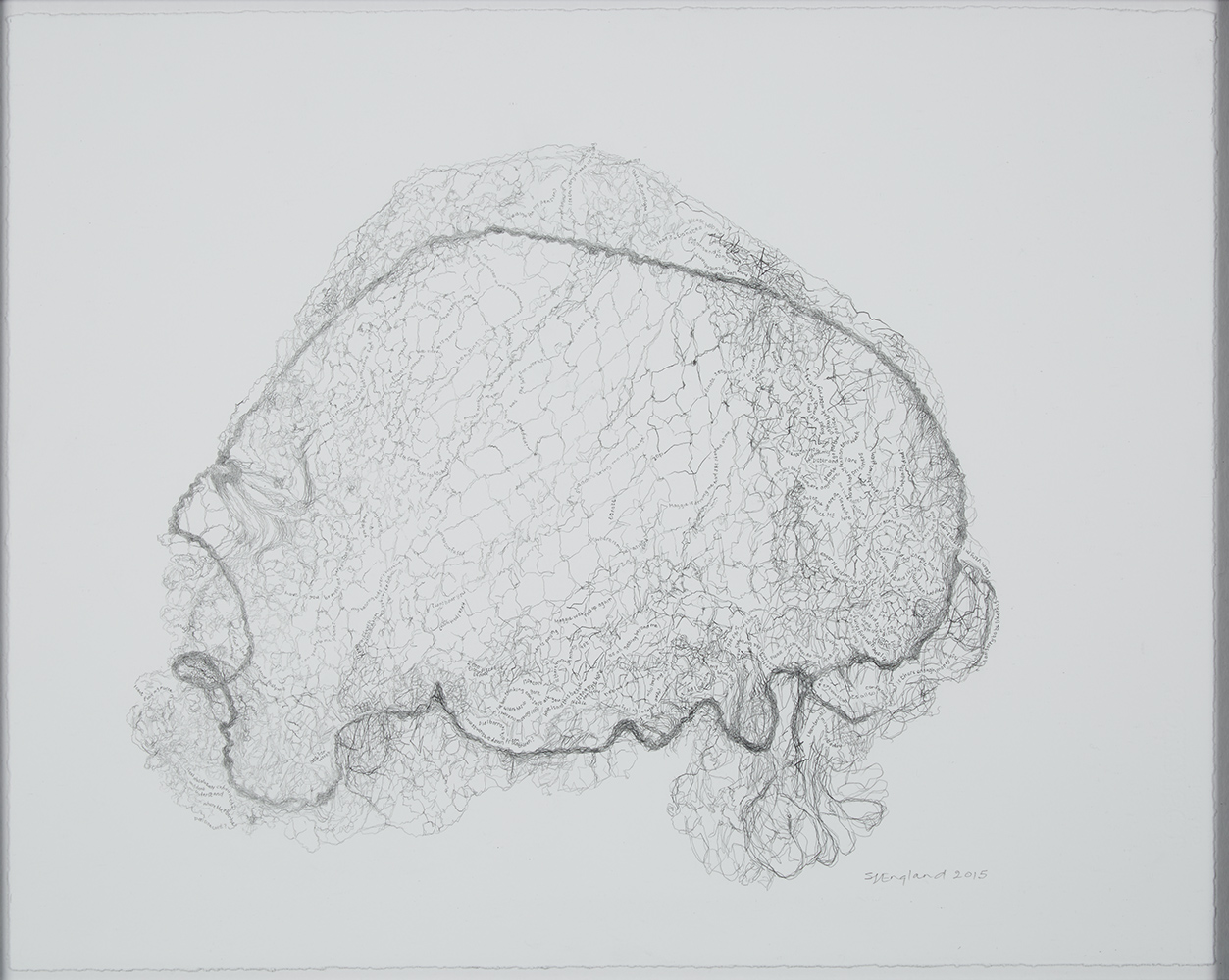
At the bottom right-hand corner of Sue England’s entry to the Jerwood Drawing Prize, a line of pencilled text reads ‘I am sorry to be like this…I seem very mixed up today.’ The words – almost imperceptible when you look at a reproduction – are at the densest part of the drawing, looped around and woven into the texture of the irregular grid which covers the centre of the paper. A thicker line runs around the overall shape; because it’s just inside its margins, it doesn’t quite define the edges. The warp and weft of the resulting grid seem to billow out above it, suggesting a sense of depth, or of something contained. It looks like a brain seen in profile through an MRI scanner, facing to the right, the cerebellum slightly lower on the left; perhaps the thicker line is an artery.
The title – The Productivity of Absence (Hairnet) – nearly, but not quite proves this initial impression wrong. The hairnet is the one worn by England’s mother every night, keeping what I imagine to be a neat perm in place: a comforting, regular routine among the slippages, gaps and disappearances of dementia. Other lines are variations on ‘I went for my pension now I can’t find my money’; ‘please help me’ turns up a few times. When England describes the net as ‘holding in her anxieties, while the connections unwind’; the pronoun is meant for her mother, but it can’t but stand for the artist too. And for most of the people looking at the drawing – the Alzheimer’s Society estimate that one in three people in the UK will suffer from dementia.
The lines that gently suggest the owner’s sadness and fear at people losing patience with her are almost unbearable, precisely because of their involvement in such a delicate structure. But when England calls it the ‘the gradual unravelling of a mind and life’, and metaphorically weaves these threads back into family history in old, cotton-weaving industrial Lancashire, there seems to be some kind of consolation in the ‘Northern work ethic’ she talks about inheriting. It’s everywhere in the understated meticulousness of this drawing.
2)
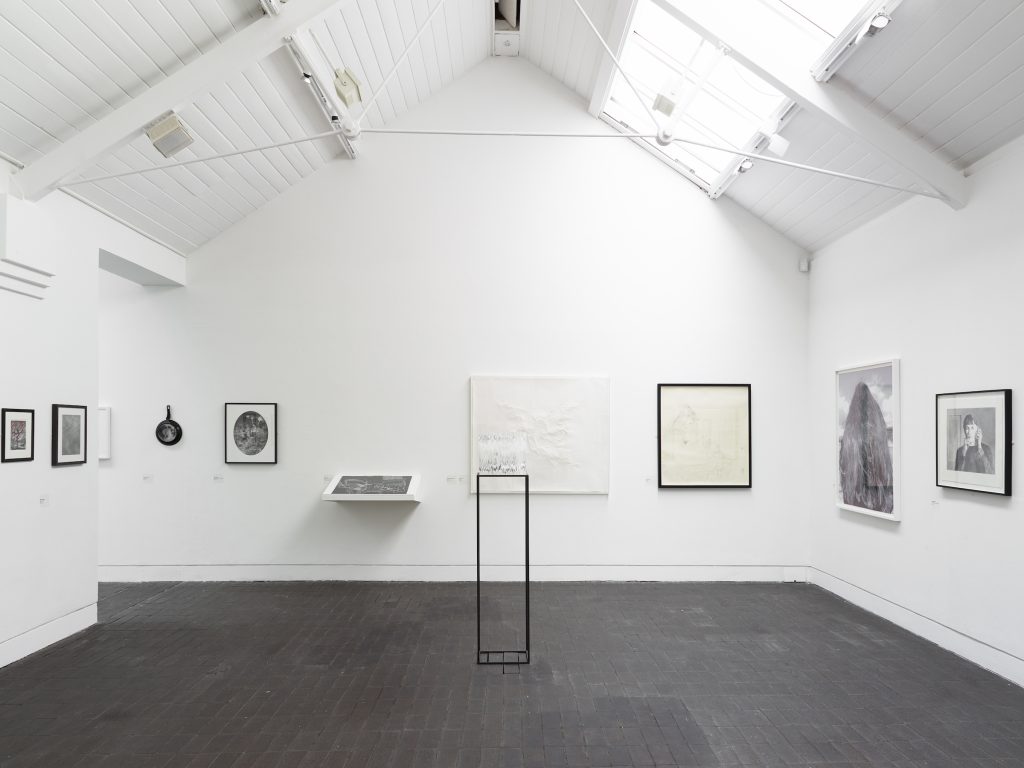
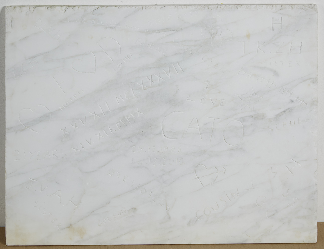
Emma Douglas’s Cato Marble Graffiti (2014/15) is a rectangle of marble, propped landscape-format between the floor and the wall, as though it hasn’t been hung yet. Like England’s piece it doesn’t reproduce very well, but as the name suggests, it’s covered in graffiti. On seeing the name Cato – I knew he was a Latin poet, but Wikipedia says grammarian too – the Roman numerals, and the arrowed love-heart, I started guessing. Was it a wry comment linking drawing to the hubris of toilet-door or school desk graffitists, underlined by the classicising touch of the material. Now this will last, I thought it might be saying, deliberately telescoping millennia of history by anachronistically scratching a mobile phone number next to Cato’s name. (I remembered, at this point, a story about a mausoleum commissioned by Silvio Berlusconi complete with grave-goods for a contemporary Pharaoh; there was apparently a marble mobile phone in there.)
Just look at the solidity of the marble; it was too weighty to be mounted on the wall alongside those other, flimsier works. But even then, just when such a gesture might seem a little pompous and self-satisfied, it might refer over to Shakespeare’s Sonnet 55, with its confidence that it’s the well-constructed declaration of love which will endure, not the expensive material.
Douglas’s statement in the catalogue reassured me at first, explaining her interest ‘in the graffiti you see carved into park benches […] I always fantasise about the lives of people who put it there.’ Then, doing this a little in the space of the line breaks, I read that the hubris had actually been mine. I’d not looked carefully enough at ‘25.12.1988 – 14.12.2010’, in Roman and Arabic numerals:
When my son, Cato, died suddenly at the age of twenty-one, we were building a kitchen for him. This piece of marble was cut out to make room for the stove.
The marks on the marble are part of his story, my graffiti about him.
3)
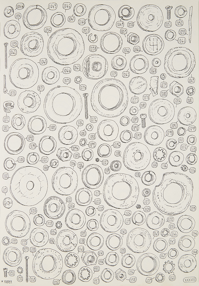
I don’t think I misinterpreted Lee John Phillips’ The Shed Project so much as interpret it in the light of Douglas and England’s pieces. For reasons that will become clear it seems important to be as accurate about the materials used as possible: an A4 Moleskine-type black-covered, cream, plain-papered notebook, and what I imagine to be a series of very fine-tipped pens, running out of ink in succession of each other. With these materials, Phillips has begun a drawn, numbered inventory of his late grandfather’s tool shed, piece by piece, including multiples: there are page upon page of washers, nuts and bolts; some of the pliers and compasses look traced onto the paper. This is only volume 1; he’s completed 4,000 of an estimated 80,000. Thickness and texture are suggested with hatching or, occasionally, an asterisk indicating an unusual material; they have a playfulness and sense of eccentricity which means that, despite the accuracy of the drawings, they look closer to a very precisely executed cartoon than a Haynes manual or set of assembly instructions. Phillips calls it ‘an exercise of discipline’ and ‘a record of my own cultural and industrial heritage, reflecting on a social ethos I feel is being sadly eroded.’ The effect is of an outline of his grandfather: a careful, exacting presence suggested through the surfaces of things he touched and arranged.
